
In this article

Have you ever needed to see your portfolio or group of projects in a different visual setting? I know most of the time I benefit from having another set of eyes on something before making a final conclusion. But what do you do when that option isn’t available? Let me introduce you to the Bubble Chart. It is one of the most compelling visualizations in the Decision Lens solution.
With numerous customizations, the Bubble Chart allows you to view your data and portfolio in unique ways to get the answers and analysis you’re seeking.
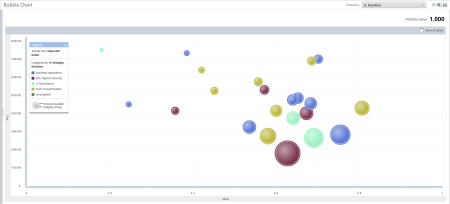
As you can see above, there are bubbles with different positions, sizes, and colors that represent factors like cost, value, and ROI. You can also incorporate detailed categories such as location, department, and urgency. Portfolio owners can even view their portfolio in a risk based heat map. You could easily see how risky a project is and in turn, how much it would cost to prevent that risk.
What other questions would you like your bubble chart to answer?


