In this article
When you're having a hard time finding an answer to something, it can sometimes help to change the way you’re viewing it.
That’s exactly what one of our customers at the Federal Aviation Association (FAA) did with their Decision Lens use case.
We were able to take the outputs from their unique Decision Lens prioritization model, and utilize third party visualization software to give them unique insights. This helped them answer their key question: “What locations are at the highest staffing risk and could benefit most from mitigation strategies?”
This seemed like a big task, and indeed it was. We circled a few times around narrowing down the scope of this question, and that's where we landed.
But with a question so large, we had to decide where to even begin building something that could answer that. Here’s what we ended up doing…
Our process had three main phases: data gathering, Decision Lens modeling, and then finally, dashboard development.
I wish I could say this was a straight-line process, but like any good adventure, we certainly cycled through these phases multiple times and went back and forth while narrowing down our approach and scope. These are the
three general steps we took, however, and I’ll dive into each one to specifically discuss what we did.
Data Gathering
First up is data.
I tend to think that data at any organization falls along three spectrums: from sparse to abundant, from messy to clean, and from disparate to well-organized. Maybe you’re lucky and you work for an organization that has an abundance of data that is impeccably clean and well-organized in a centralized and easy to access database—if so, please reach out to me because that would be a dream to work with!
But I doubt any of us really feel that confident about the data that we work with on a daily basis. Maybe this second scenario is a little bit more reasonable—a good amount of data within reach, that is moderately clean and needs some minor tweaking in order to work with and is housed in maybe a few databases or spreadsheets that lack some version control. This is probably more so the standard in most of our organizations.
Or maybe you’re scenario three, and might be part of a very young organization or one that just lacks the tools required to collect massive amounts of data and therefore it can’t be clean, messy, disparate, or well-organized if it doesn’t even exist!
The great thing about any of these scenarios is that once you’ve identified where you fall on the spectrum, we can design a Decision Lens model to accommodate and incorporate that data into the prioritization process.
For our FAA use case, I’d certainly say that the organization fell into the second scenario —there was a vast amount of data available, it was relatively clean and well organized, and generally came from reliable databases and not offline spreadsheets.
After identifying all of the data that a team has available to them, the next logical step is to identify what pieces of the data are specifically needed to answer the specific question(s) trying to be answered.
Decision Lens Modeling
In the case of FAA, this is where Decision Lens came in.
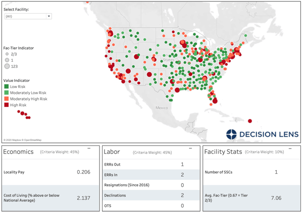
We developed and iterated on multiple criteria that would help identify high-risk locations, but that also aligned to data that the team had available. We ended up with over 15 unique criteria and data points that fell into these three categories or parent criteria: Economic Factors, Labor Factors, and Facility Factors.
One of the really unique parts of this model is that all 15 criteria are entirely metric-driven—that is, we simply plug in the data that the FAA team has available and a rating is automatically generated. This enables us to continually and quickly update the model as new data comes into the organization and ensures that the model is entirely objective.
Once we identified the data we needed, the team collected it from the multiple sources, and we consolidated it all into Decision Lens. Decision Lens then did its magic through the Analytic Hierarchy Process and ultimately produced what we call our 1-n list, which is a prioritized list of 424 locations across the country, with the locations at the top of the list being identified as the “highest risk”.
At this point, a majority of the work had been done and we got the output we wanted, however it’s a bit difficult to take that list of 424 locations and drill down into each one to identify areas for mitigation. That’s where we decided to take the outputs of the Decision Lens model and visualize them in a different way.
Dashboard Development
Admittedly, a visualization is usually what gets the “oohs and ahhs” but is usually the most simple part of the process! All of the hard work has already been done in identifying and collecting the data, developing the criteria and rating scales to feed the model, and the algorithm calculations to generate the outputs.
I think of it kind of like baking bread (like so many people seem to be doing during this time of quarantine) - we already collected and measured the ingredients, mixed them all together, kneaded the dough, added more flour where we needed it and so on, and now we’re just popping it into the oven. It’s the easiest final step but it takes us from something generally inedible to something delicious.
That’s what we did here!
We used Tableau as the visualization software because it was something that FAA had access to, was familiar with and used quite frequently. There are plenty of software options on the market that can be used as well. I’ve used Microsoft’s Power BI in the federal setting before, and even Excel can build a pretty basic dashboard visualization. It’s all a matter of what you have available and what or how you need to visualize your data. (Pro tip: if GIS is your means of visualization, check out our upcoming DLU Webinar: How to Use GIS to Improve Capital Planning)
Once we pulled it all together, FAA was able to understand their data by simply visualizing it in a way they had never visualized it before - geographically, with indicators determined by the risk-level prioritization that was the ultimate output from Decision Lens.
This has given them the ability to understand the highest risk locations at a quick-glance, and then use the functionality of the dashboard to understand which data points rated the lowest so that they can begin to design mitigation strategies to address them…and it looks pretty cool too!
Do you have a similar question that needs addressing? We’d love to help you change the way you’re viewing your problem by incorporating Decision Lens methodologies! Please reach out to a member of the Decision Lens team today - we’d love to chat with you!